
Visual Block will help you to interact through a visual interface to give a clear and direct insight to the underlying data. The visual representation enables the decision makers to have a quick grasp of the concepts and also identify any new or unusual incidents.
- Visualization Blocks can be added only after adding a DQL/ SQL Block
- Visualization Blocks are dependent on the result obtained from the DQL/ SQL Block.
How to create a visual block?
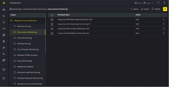
- Hover on the Workbooks icon on the left navigation bar, it will display the folder wise view of existing workbooks in the tenant (previously known as cluster).
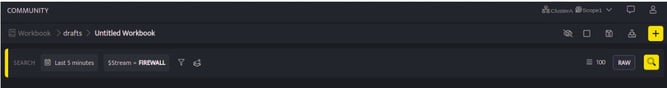
- Click the plus icon at the top right corner , the following Search GUI screen will be displayed.
-
You can now select streams while building a query using the search block. Select the stream, filters, and set the duration to fetch details
-
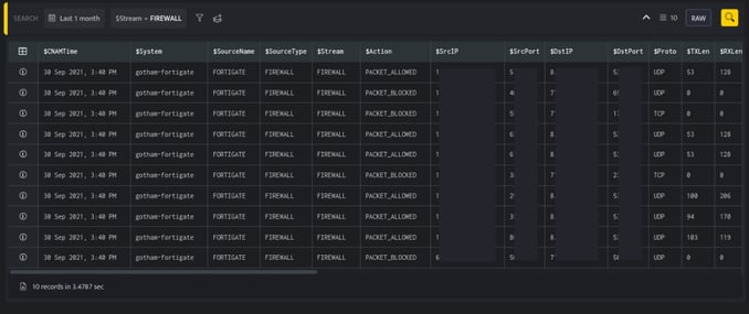
Select/Enter the required fields to build your query and click Run, the following screen is displayed.
- Click the plus icon on the Workbook page and select Visualization from the list, the following screen will be displayed.

- You can set the graphical view in a pie chart, line chart and column chart as per your requirement.
Pie Chart
Pie charts are a simple and effective way to visualize data. DNIF offers pie charts in simple and stacked versions.
Select the following parameters to create a Pie chart.| Fields | Description |
| Type | Select Pie Chart |
| Primary | Select the primary value of the chart to be displayed. |
| Secondary | Select the secondary value of the chart to be displayed. |
| Type of chart | Select the type of chart to be displayed such as:
|
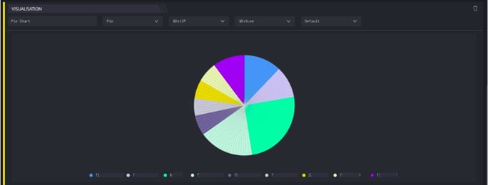
- Select all the above fields and a pie chart will be displayed.
- Displayed below is the default pie chart
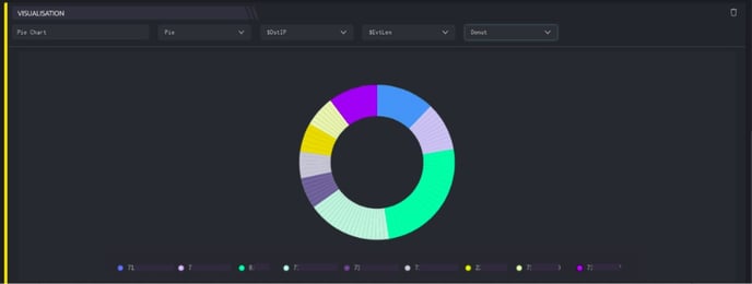
- Displayed below is a donut chart
Line Chart
Line charts have been traditionally used to visualize timelines. You can create an outline for a series of events that happen over a period of time.
Select the following parameters to create a line chart.
| Parameters | Description |
| Type | Select Line Chart |
| Primary | Select the primary value of the chart to be displayed. |
| Secondary | Select the secondary value of the chart to be displayed. |
- Select all the above fields and a line chart will be displayed.
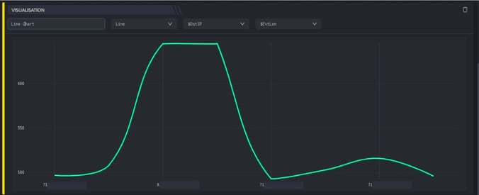
- The above chart displays a line chart, hover to view the fields captured.
Column Chart
Column charts are typically used to compare several items in a specific range of values. In addition, it helps you to view a Stacked and Grouped bar chart. Users can create a group for a group of events/entities.
- Select the following parameters to create a Column chart.
| Parameters | Description |
| Type | Select column chart |
| Primary | Select the primary value of the chart to be displayed. |
| Secondary | Select the secondary value of the chart to be displayed. |
| Type of Column Chart | Select the type of column chart to be displayed such as Default, stacked and group
|
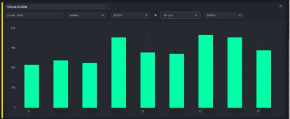
- Displayed below is the default column chart.
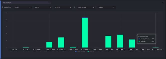
- Displayed below is the stacked column chart.
- Similarly, you can generate group column chart
- All the above visualizations can be saved into the workbook.
Bar Chart
Bar charts are typically used to compare several items between different groups or track changes over a period of time.
- Select the following parameters to create a Bar chart.
| Parameters | Description |
| Type | Select bar chart type |
| Primary | Select the primary value of the chart to be displayed. Example: Dst IP, src IP etc |
| Secondary | Select the secondary value of the chart to be displayed. |
| Type of Chart | Select the type of bar chart to be displayed such as Default, stacked and group
|
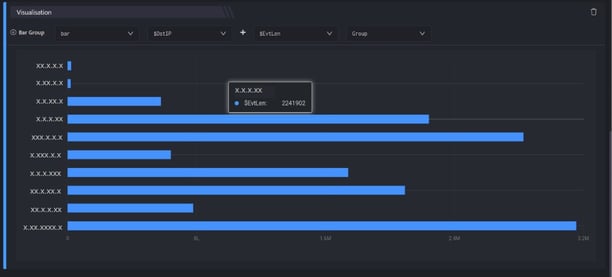
- Displayed below is a group bar chart
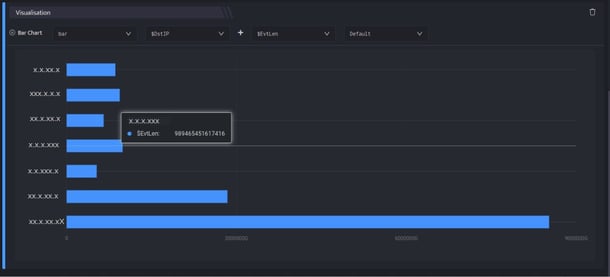
- Displayed below is the basic bar chart
- Similarly, you can generate stacked bar chart.
Radial Bar Chart
Column charts are typically used to compare several items in a specific range of values.
Select the following parameters to create a radial bar chart.
| Parameters | Description |
| Type | Select Radial Bar chart |
| Primary | Select the primary value of the chart to be displayed. |
| Secondary | Select the secondary value of the chart to be displayed. |
| Type of Chart | Select the type of radial chart to be displayed such as:
|
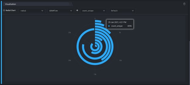
- Displayed below is the default radial bar chart.
- Similarly, you can generate stacked radial chart.
Area Chart
Area charts are typically used to compare change in one or more quantities over time.
- Select the following parameters to create an area chart.
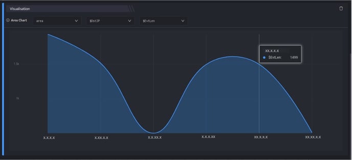
Parameters Description Type Select Area chart Primary Select the primary value of the chart to be displayed. Secondary Select the secondary value of the chart to be displayed. - Displayed below is the area chart.
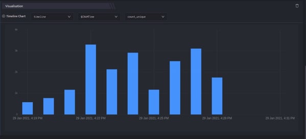
Timeline Chart
A timeline chart is an effective way to visualize a process using chronological order. Since details are displayed graphically, important points in time can be easily seen and understood.
- Select the following parameters to create an timeline chart.
Parameters Description Type Select timeline chart type Primary Select the primary value of the chart to be displayed. Secondary Select the secondary value of the chart to be displayed. - Displayed below is the timeline chart.
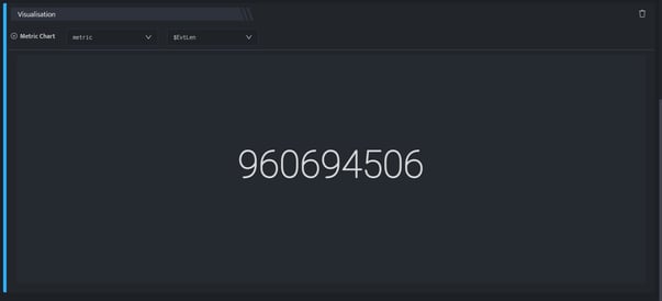
Metric Chart
Metrics are numbers that tell you important information about a process under question. They tell you accurate measurements about how the process is functioning and provide a base for you to suggest improvements.
- Select the following parameters to create an metric chart.
Parameters Description Type Select Metric chart Value Select a value to be displayed on the chart. - Displayed below is the metric chart.
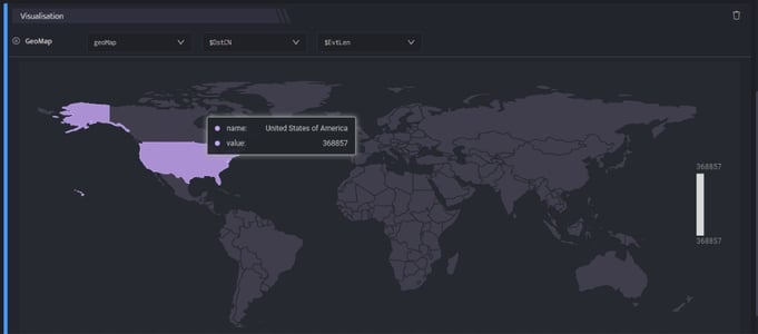
Geomap
A geomap is a map of a country, continent, or region with colors and values assigned to specific regions. Typically, we use GEO Maps to show traffic, and other metrics based on where the end user is.
- Select the following parameters to create an geomap chart.
Parameters Description Type Select geoMap chart Primary Select the primary value of the chart to be displayed. Secondary Select the secondary value of the chart to be displayed. - Displayed below is the geomap chart.
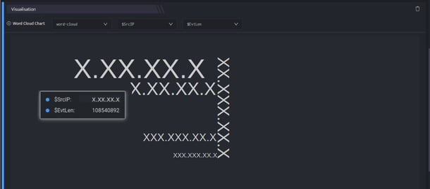
Word-Cloud
Word clouds are graphical representations of word frequency that give greater prominence to words that were used frequently in the network. The larger the word in the visual, the more frequent it was used.
- Select the following parameters to create an word cloud chart.
Parameters Description Type Select Word-Cloud chart Primary Select the primary value of the chart to be displayed. Secondary Select the secondary value of the chart to be displayed. - Displayed below is the word-cloud chart.
For more details on details on Workbooks, refer Create a Workbook